Super Purposes - Website Redesign
Course Registration Enhancement | Evaluative Research
Project Overview
My Role: UX Researcher (Research Lead)
Timeline: 5 months
Team: UX Designer, Engineers, and Marketing Lead
Research Method: Concept testing, In-depth interviews (IDIs), and post prototype surveys.
My role:
As the sole UX Researcher, I:
Defined research strategy and led execution from discovery to testing
Conducted competitive analysis, usability testing, and concept mapping
Delivered low-fidelity prototypes and guided redesign suggestions
Collaborated with designers and engineers to address usability gaps
Measured success via analytics tracking post launch
Project Journey & Impact Overview
increase in registrations and video views
25%
Fewer clicks to course registration
10%
in course video traffic
Goal
Redesign the Super Purposes website to improve user trust, clarify what the company offers, and increase registrations for online career development courses.
Let's Dive Deeper!
The Problem Statement
Despite offering unique career development courses for recent grads, military spouses, and job seekers, Super Purposes was struggling with:
Low registration numbers
A homepage that lacked clarity about the company's purpose
A confusing path to course selection and enrollment
Poor visual and linguistic trustworthiness
Participants said things like:
"This website looks like it will give me a virus.”
The user experience was not only ineffective, it actively discouraged engagement.
Research Process
Before starting research, I aligned with our design and engineering teams to understand site limitations and business goals. From there, I moved step by step, starting with foundational discovery to understand our users, then iterating toward specific redesign strategies. Each method built on the last, connecting user insights to design decisions.
User Exploration & Persona Building
We needed to understand who our users are and what they’re looking for before making changes.
Method: Persona Development
Why this method & goal: To ground research in user motivations and pain points when searching for career support.
Who was involved:
• Targeted students, remote job seekers, and mid career professionals
• Used secondary data and observational insights
Process:
• Created a persona for Guilliam Johnson, an NYU student with career anxiety
• Outlined goals, frustrations, and needs
What came out of it:
• Uncovered what users expect from a career site: guidance, trust, and clarity
• Raised the core question: “What values are we missing?”
Transition:
To answer that question, I moved into analyzing competitors to see what successful platforms were doing better.
Competitive Analysis
With our user personas defined, I wanted to understand how other companies were addressing similar user needs. This led me to conduct a competitive analysis to benchmark what successful career sites were doing differently.
Method: Competitor Feature & UX Audit
Why this method & goal: To understand how competitors guide users to conversion and build credibility.
Who was involved:
• No direct users; conducted independently
• Shared findings with design and leadership
Process:
• Audited multiple competitor websites for layout, registration flow, visual hierarchy
• Assessed trust signals like testimonials, professional design, and content clarity
What came out of it:
• Other sites used video, clear CTAs, and modular content to build trust
• Super Purposes lacked industry standard structure and messaging
Transition:
With an idea of where we fell short, I moved into usability testing to validate how users interact with our
current site.
Usability Testing
Insights from the competitor audit gave us direction but we needed to see how users were actually experiencing our site. I transitioned into usability testing to observe where real users struggled and why.
Method: Moderated Usability Testing with Think-Aloud
Why this method & goal: To identify trust, navigation, and comprehension issues in the existing flow.
Who was involved:
• Several participants across our target audience segments
• Designers and engineers received test highlights and recordings
Process:
• Asked users to describe first impressions
• Gave tasks like “Register for a course” and “Explain what this company offers”
What came out of it:
• 0 participants successfully registered for a course
• First impressions included confusion, lack of trust, and poor professionalism
• Navigation was inconsistent and unclear
Transition:
Having identified key UX breakdowns, I organized insights via affinity diagramming to distill themes.
Affinity Diagramming
After completing usability tests, I was left with dozens of raw comments and observations. To make sense of them, I organized the data into thematic clusters using affinity diagramming.
Method: Affinity Mapping
Why this method & goal: To uncover shared user reactions and prioritize UX issues.
Who was involved:
• Internal team reviewed Miro board of user comments
Process:
• Clustered user feedback into categories: trust, visual design, language tone, navigation
What came out of it:
• Most common issue: lack of trust
• Users felt lost or skeptical from the first click
Transition:
To turn themes into strategic design moves, I created a concept map to align user and business goals.
Concept Mapping
Once we had clear patterns and priorities, we needed to translate them into actionable design decisions that aligned with business goals. I used concept mapping to bridge the gap between user feedback and
business strategy.
Method: Concept Mapping
Why this method & goal: To align content and flow with business KPIs like course registration and video engagement.
Who was involved:
• Stakeholders from engineering and marketing
Process:
• Mapped current vs. future-state content structure
• Collaborated with engineers on constraints (SEO, framework limitations)
What came out of it:
• Clearer registration flows with updated CTAs
• Roadmap for technical feasibility and phased design rollouts
Transition:
With buy in from our internal stakeholders, I built a low-fidelity prototype to visualize proposed changes.
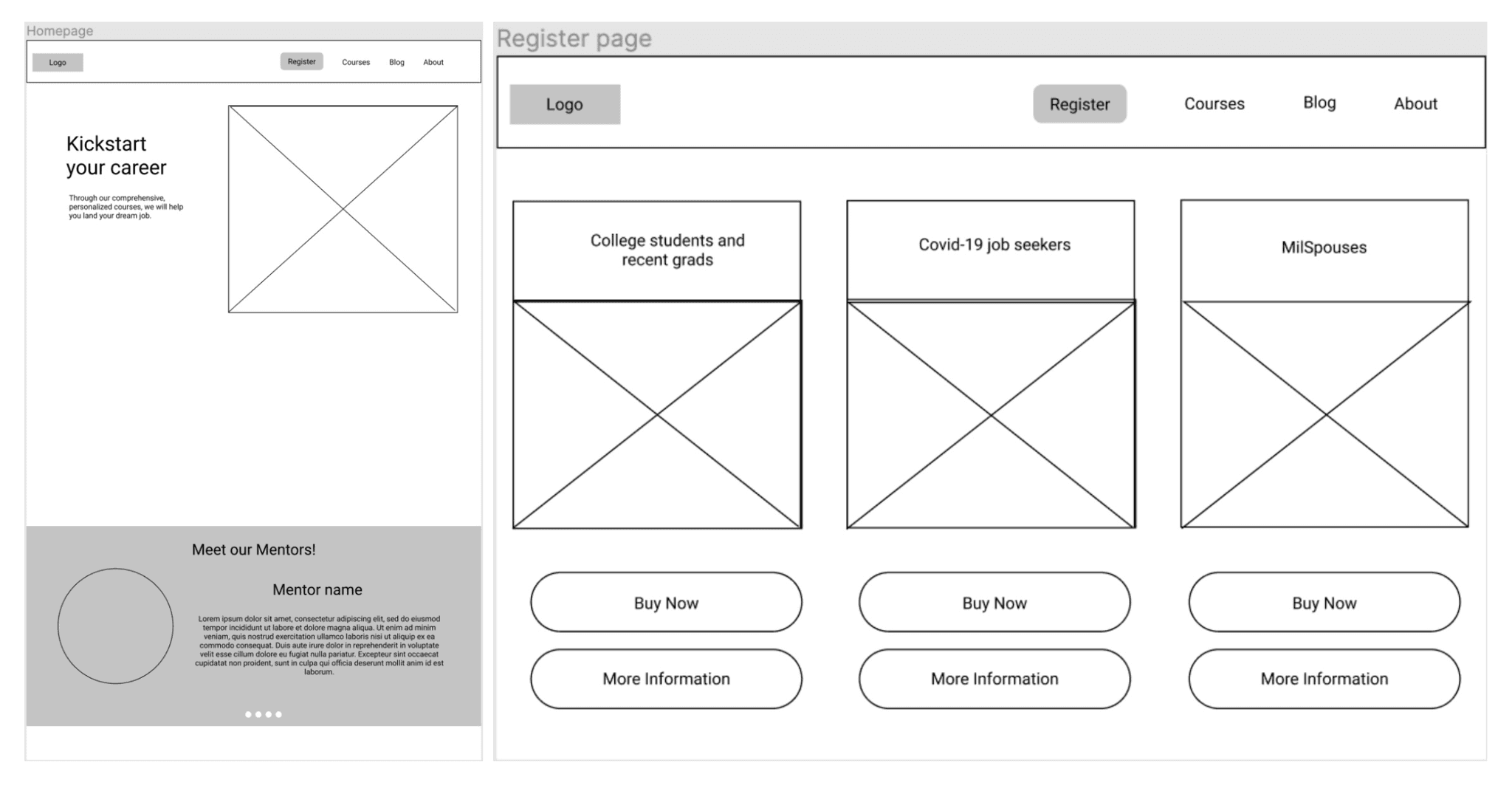
Low Fidelity Prototyping
With aligned goals and a clear vision, I moved into prototyping to bring our solution to life and guide the design team with a clear structure for layout, flow, and content.
Method: Wireframing in Figma
Why this method & goal: To visualize a cleaner, trust-driven homepage and clearer course registration flow.
Who was involved:
• Design team used my prototype to begin final design
Process:
• Designed wireframes for homepage, pricing tab, and course menu
What came out of it:
• Proposed clear navigation, bolder typography, and direct link to pricing/courses
Transition:
Final designs were handed off to engineering; we tracked impact using Google Firebase.
Overall Reflection
My POV
This project showed me how early UX research can completely reframe a product’s direction. What started as “make the homepage better” evolved into deeply understanding how trust, clarity, and business alignment must work together.
Hearing a user say, “This looks like a scam site” was a wake-up call. We weren’t just designing prettier pages. We were restoring credibility. It reminded me that great UX often begins by removing doubt.
If I had more time, I would have:
Run follow-up usability tests on the new design
Tracked retention and repeat visits over time
Conducted deeper brand perception research