Web App Research | Evaluative Research
Project Overview
My Role: UX Researcher & Product Manager (Product Lead)
Timeline: Q3 2024 - Ongoing
Team: Senior Product Manager, and 2 UX Designers
Research Method: User testing, Click tracking, Session replays, and A/B testing
My role:
• Designed and executed a multiphase research strategy to identify key user pain points and prioritize solutions
• Conducted competitor audits and user testing sessions to uncover industry best practices and validate user needs
• Ran behavioral analysis using HotJar and Google Analytics to understand user journeys and pinpoint drop-off areas
• Collaborated with designers to test layout changes aimed at reducing friction and improving task completion rates
• Measured improvements through A/B testing and user sentiment to ensure solutions delivered measurable impact
Project Summary: Improved pet insurance enrollment by leading UX research and funnel redesign, boosting registrations by 3% and reducing user abandonment rate by 2%.
Project Results & Impact Overview
increase in overall enrollment MoM (April 2025 vs May 2025)
Decrease in Drop Off (Abandonment rate)
increase in interaction with coverage options (click through rate measured via Hotjar click maps)
Goal
Optimize the enrollment experience on the Healthy Paws website to reduce abandonment, improve trust, and increase conversion (bind) rates. Evaluate user pain points, benchmark against competitors (Nationwide, Embrace), and deliver actionable UX changes to streamline the customer enrollment process.
Let's Dive Deeper!
The Problem Statement
Despite high brand trust (80%), many users were abandoning the enrollment funnel without completing their pet insurance enrollment. Analytics and HotJar revealed users often skipped critical coverage sections or dropped off after seeing the initial quote. Our challenge was to understand what caused the challenge and optimize the flow to improve clarity, customization, and decision confidence.
Research Process
Before diving into research, I aligned with the UX Manager and Product Owner to review internal Google Analytics metrics, HotJar session recordings, and support insights from customer service. The data pointed to a clear trend: users often dropped off or skipped the coverage details page right after receiving their quote. While we had the what, we lacked the why. That’s where research came in. I designed a phased research plan that would help us understand competitor strategies, visualize user behavior, and validate changes with real users, starting with a competitive analysis to establish baseline patterns.
Competitive Analysis
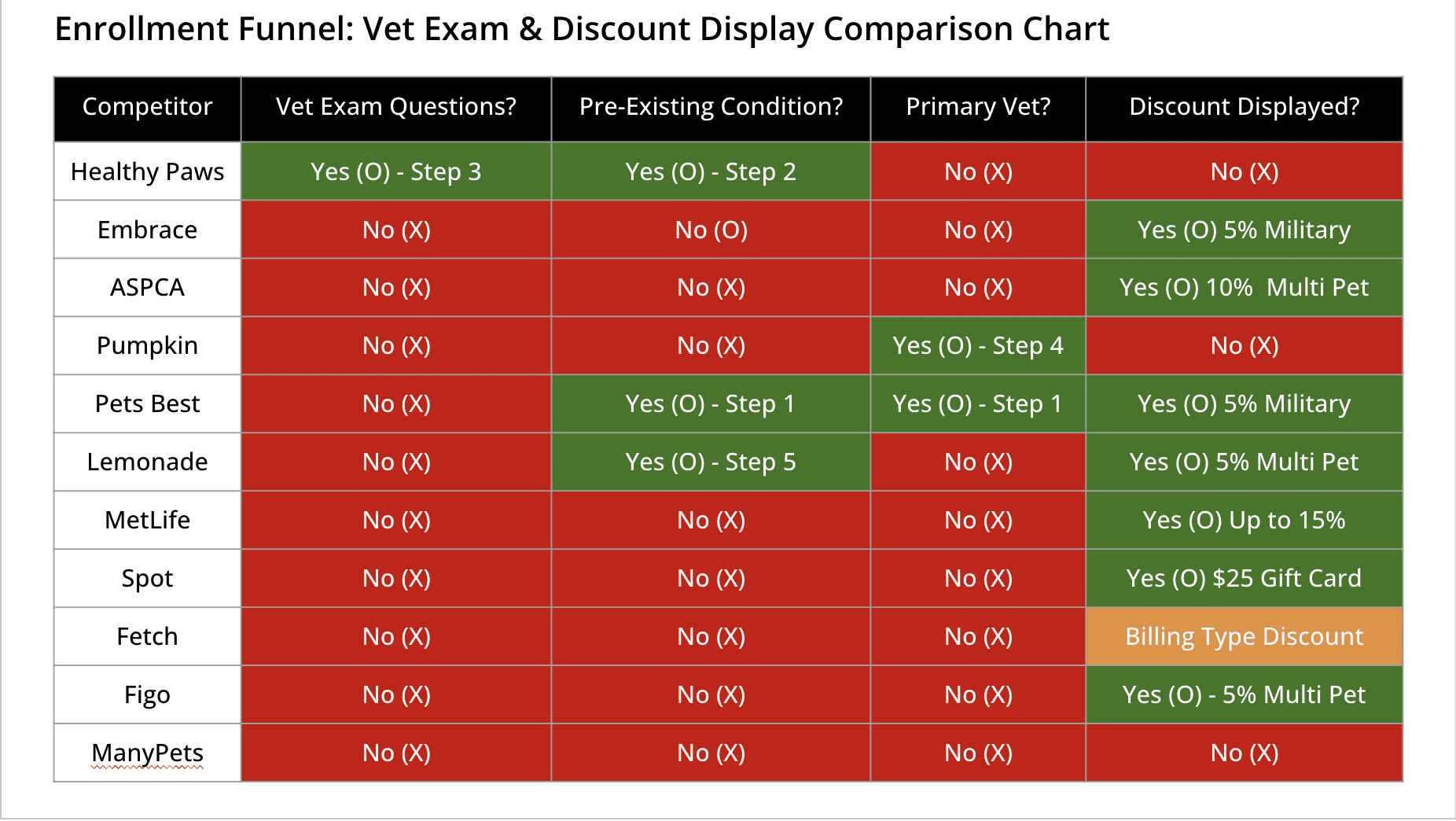
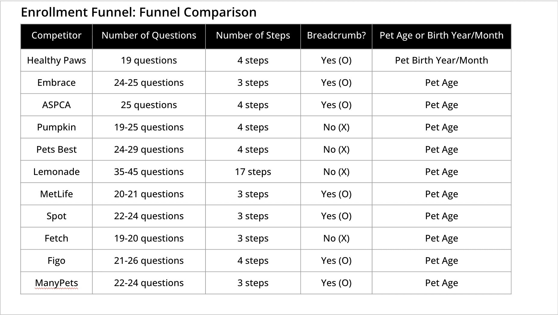
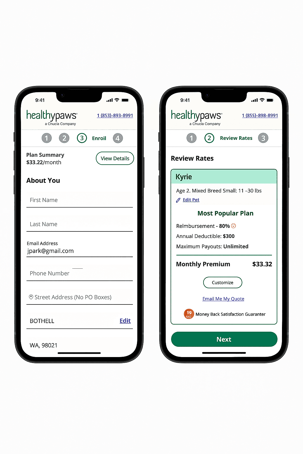
Image 1 (On the left) Competitor Breed Selection: Most competitors offer a search bar for breed selection, making it easy for users to find their pet’s breed quickly.
Image 2 (On the right): Healthy Paws Breed Dropdown: Healthy Paws’ breed selection forces users to scroll through a long dropdown with no search option, creating unnecessary friction and frustration.
Behavioral Analysis
After identifying opportunities to improve our enrollment funnel, I started by benchmarking competitors to understand industry best practices and features that drive conversions.
Hotjar & Google Analytics:
Analyzed actual user interactions in the enrollment funnel to see if observed pain points led to dropoff or confusion.
How Behavioral Analysis was Conducted:
• Used Hotjar click tracking, session replays, and Google Analytics.
• Methods included funnel analysis, click heat maps, and scroll depth tracking.
Goal:
To visualize exactly where users struggled or disengaged, and confirm if competitive analysis findings held true in practice.
Who was involved:
Findings were reviewed with Design, Product, and Engineering.
Process:
• Monitored clicks on CTAs, toggles, and navigation using Hotjar.
• Analyzed scroll depth and session replays.
• Measured how many users skipped or engaged with coverage and eligibility sections.
Key Findings:
Out of 20 sessions viewed:
• 60% of users clicked “Next” after viewing the quote, skipping coverage details.
• 80% of users spent over 30 seconds scrolling through the breed dropdown, searching manually for their pet’s breed due to the lack of a search feature.
• Only 30% scrolled past pricing breakdowns; most ignored coverage modules.
• Drop off rates spiked at eligibility questions, especially those requiring birth date or vet exam info.
Key Insight & Next Step:
Behavioral data confirmed friction at the specific points identified in the competitive analysis, but didn’t explain user motivations. To understand the why behind user behavior, I next conducted moderated usability tests to capture user pain points in real time.
Moderated Usability Testing
We had identified the problem area through behavioral data and now it was time to hear directly from users to understand their perceptions and expectations.
Method: Remote Moderated Testing
Why this method & goal: To validate behavioral findings and uncover perception issues around layout, content clarity, and terminology in the enrollment flow.
Who was involved:
• 10 prospective pet insurance customers (had pets, but no insurance yet)
• Sessions and insights shared with the UX team
Process:
• Participants walked through the quoting and enrollment process using the current site
• Used think-aloud protocol to capture confusion, assumptions, and hesitation
What came out of it:
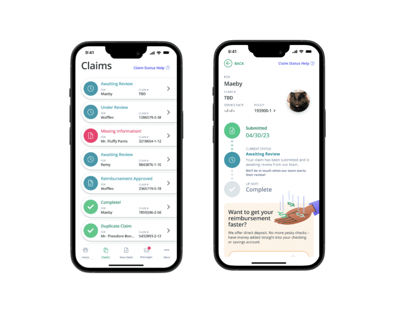
• 80% of users skipped the coverage section at the bottom of Step 2
• Those same users assumed they were finished after seeing the quote price
• Insurance terminology (e.g. “Medical Record” “SOAP Notes”) caused confusion and hesitation
Transition:
With the both behavioral and qualitative insights, I collaborated with design to test layout and content adjustments aimed at increasing visibility and comprehension.
Design Ideation, Iteration & A/B Testing
With clear pain points validated through usability testing, I worked with designers to prototype and test layout changes aimed at increasing visibility of the coverage section and improving comprehension before users clicked “Next.”
Method: Design Prototyping + A/B Testing
Why this method & goal: To evaluate whether layout changes, specifically repositioning the coverage section would improve user engagement and reduce premature drop off.
Who was involved:
• UX Designer, Engineering, and Product teams for implementation and tracking
Process:
• Created a variant where the coverage section was moved above the “Next” button (vs. current control version)
• Rewrote key terms in plain language for better understanding
• Conducted A/B testing on live traffic using Google Analytics (GA) and HotJar for behavioral tracking
What came out of it:
• Placement change increased coverage engagement by 22%
• Scroll depth improved by 18%, with users spending more time reviewing plan details
• Early stage quote to bind conversion increased by ~12% in the variant group
Transition:
With promising results, I shared these insights in a cross functional meeting with Senior Designers and recommended a phased rollout of similar layout improvements sitewide.
What I'm Doing Now & What's Next
This project is still in progress. Following the initial A/B test, I’m currently:
• Analyzing multi device performance (desktop vs. mobile quoting behavior)
• Testing new coverage customization visibility patterns (e.g. collapsible modules and accordion)
• Partnering with Product and Design to iterate on terminology clarity based on user feedback
Next, I plan to:
• Conduct longitudinal testing on post bind behavior to assess retention and comprehension
• Implement micro surveys during the quoting flow to gather in the moment sentiment
• Propose a phased rollout strategy for broader site updates
Overall Reflection
Product Management Impact
• Aligned Design, Product, and Engineering around a phased testing plan grounded in behavioral data
• Translated research insights into clear product requirements and UI priorities (e.g. CTA placement, copy changes)
• Managed cross functional check ins and debriefs to track progress, share findings, and make decisions
• Advocated for iterative rollout, balancing UX improvements with technical feasibility and business deadlines
• Proposed ongoing tracking mechanisms (e.g. post launch surveys, longitudinal studies) to support continuous optimization
My POV
This project reinforced how small layout decisions can create big usability shifts, especially in high stakes, high intent flows like insurance. The issue wasn’t that users didn’t care; it was that we weren’t surfacing information at the right time.
If I had more time, I would:
• Run mobile first quoting optimizations
• Test iconography alongside terminology for faster comprehension
• Launch a continuous feedback loop (post survey) to monitor confidence post purchase
• Add dismissible tooltips (such as accordion) or short guided hints for first time visitors to improve onboarding without overly distracting their enrollment process (able to exit out of the module quickly).