Mobile App Development | Evaluative Research
Project Overview
My Role: UX Researcher Manager (Full Product Owner)
Timeline: Q3 2023 - Q2 2024
Team: 2 Designers & 2 Engineers
Research Method: Early user testing, competitive analysis, card sorting, benchmark usability test, and design iteration.
My role: I led this project end to end from identifying user problems to guiding design iterations and collaborating with engineering for implementation. In addition to conducting all research myself, I also acted as the product owner, managing priorities, communicating scope, and ensuring business alignment.
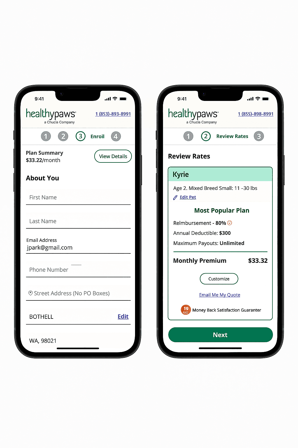
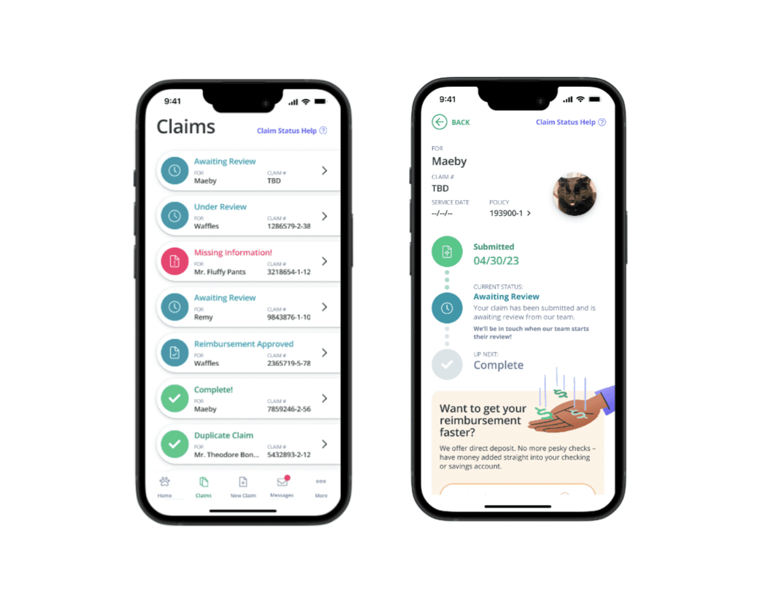
Due to the nature of Chubb (Healthy Paws Pet Insurance)'s non-disclosure agreement, I cannot share through image details about my research process on my website. More specific information on my images, visuals, and designs for Chubb (Healthy Paws Pet Insurance) can be shared privately in a portfolio presentation upon request by emailing me.
Project Results & Impact Overview
increase in mobile app claim filing YoY
(Q3 2023 - Q3 2024)
Reduced mobile claim related support calls from 50+ to average of less than 10 a day
increase in direct deposit set up YoY (Q3 2023 - Q3 2024)
Goal
• Identify where users encounter friction within the mobile app experience
• Understand which tasks and flows are most confusing or difficult to complete
• Increase successful mobile claim submission
• Improve comprehension of claim statuses and terminology
• Reduce support calls
• Encourage direct deposit adoption
Let's Dive Deeper!
The Problem Statement
Healthy Paws customers struggled with app navigation and claim filing leading to:
Policy cancellation rate due to frustration
Daily support calls about mobile claim filing challenges
Adoption rating of mobile claim filing and direct deposit set up
Research Process
As the research manager driving this project, I initiated it by meeting with internal stakeholders including the customer care team and data analytics team to gather insights from call logs, feedback data, and mobile usage trends. This gave us a clearer picture of where customers were struggling, especially around claim submissions and reimbursement workflows.
From there, we reviewed support case patterns and internal KPIs, which highlighted recurring frustrations with navigation, terminology comprehension, and task completion.
To validate and deepen our understanding, we kicked off our research with usability testing of the current app. and deepen our understanding, we kicked off our research with usability testing of the current app.
Early User Testing
Why this method & goal for this method: We needed quick, direct insights from real customers to uncover usability pain points in the existing mobile app experience.
Participants: 5 Healthy Paws customers via UserTesting.com
Tasks Evaluated: Filing a claim, uploading invoices, setting up reimbursement
Key Findings:
• 100% failed to find multi photo upload
• 80% struggled with claim terminology ("claim in review," "reimbursement issued")
• 60% couldn’t locate reimbursement settings, such as direct deposit setup
• 80% couldn’t understand how much they were getting reimbursed for processed claims
These results revealed serious breakdowns in task completion and information comprehension. We used these insights to prioritize a redesign that would clarify financial information, expose reimbursement settings earlier in the user journey, and rework confusing terminology.
Competitive Analysis
Why this method & goal for this method: After identifying key usability breakdowns through user testing, especially around navigation, terminology, and invoice uploads. We needed a broader perspective to avoid reinventing the similar issue. I conducted a competitive analysis to explore how other pet insurance apps address these same challenges, to identify patterns we could adapt for Healthy Paws, and to understand best practices and discover usability patterns among top competitors that could inform our redesign.
• Analyzed 5 competitors: Lemonade, ASPCA, Embrace, Fetch, Pet’s Best
• Focus areas: Navigation layout, claim workflows, upload features, terminology clarity
Findings:
• Competitors used clearer bottom nav
• Better upload flows (e.g. choosing photos from device)
• Direct deposit setup was prominent
Card Sorting
Why this method: After the competitive analysis helped validate the need for clearer navigation and grouping of features, we wanted to understand how our users naturally think about and categorize these tasks. Card sorting allowed us to tap into user mental models, ensure our new app structure reflected how users expect to find information, to uncover user mental models for organizing key app features, and determine optimal navigation labels and groupings.
Participants: 10 users via Optimal Workshop
Goal: Understand how users categorize and access claims, profile, and reimbursement features
Findings:
• User grouped "Claims" and "View Claims" consistently
• "Get the Mobile App" and "Refer a Friend" often grouped together
• Ambiguity around where "Policy" info should live
These insights directly shaped our new navigation structure
Design Strategy & Prototyping
Following the insights from card sorting and competitive analysis, it became clear that our navigation system and key task flows needed significant restructuring. I used these findings to define product priorities and align the team around a vision for a streamlined and more intuitive app experience (claim filing, understanding claim statuses, navigation to direct deposit set up, etc).
As product owner, I defined the scope of redesign priorities based on research findings and led discussions with design and engineering to align on feasible, high impact changes of redesign priorities based on research findings.
• Introduced a bottom sticky navigation with: Home, View Claim, File Claim, Messages, More
• Enhanced invoice upload with multi photo support and file selection
• Simplified claim status language for user comprehension
• Prioritized visibility of reimbursement method settings, such as direct deposit and payment setup
• Added clear breakdowns for reimbursement amounts on processed claims
Collaborated with designers to prototype wireframes and worked with engineers during implementation to ensure alignment. our users naturally think about and categorize these tasks. Card sorting allowed us to tap into user mental models, ensure our new app structure reflected how users expect to find information, to uncover user mental models for organizing key app features, and determine optimal navigation labels and groupings.
Validation & Iteration
After implementing the redesigned experience based on our research and prototyping, it was critical to validate whether these changes actually improved the user experience. We needed evidence that the new design solved the original pain points and delivered measurable improvements in usability and clarity.
Why this method: To validate that design changes addressed previous usability issues and improved task completion and comprehension. To validate that design changes addressed previous usability issues and improved task completion and comprehension.
• Ran benchmark usability tests post redesign to validate improvements
• Key Tasks: Filing a claim, checking claim statuses, and setting up direct deposit
• Follow up sessions showed significant improvement in navigation efficiency, user comprehension of reimbursements, and success in locating direct deposit options
• Coordinated timelines with engineering and ensured feature readiness through regular QA reviews and alignment check points of redesign priorities based on research findings.
Overall Reflection
Product Management Impact
• Drove research to implementation workflow across 3 teams
• Balanced business goals (retention, call reduction) with user needs
• Prioritized features using research findings and engineering input
• Owned communication and alignment with stakeholders throughout the project
What I would Do Next
• Implement in app NPS & feedback widgets to track live sentiment
• Conduct study on new customer onboarding and navigation (for the first time customer)
• Improve educational content for first time claim filers (creating PDF of definitions that does not require long scroll and reading).
My POV
Good design should make things simple. I believe that when people are dealing with something as important as pet insurance, the experience should be straightforward, helpful, and stress free. I use research to uncover where people get stuck and guide teams toward solutions that are intuitive for people who are new to the pet insurance industry.